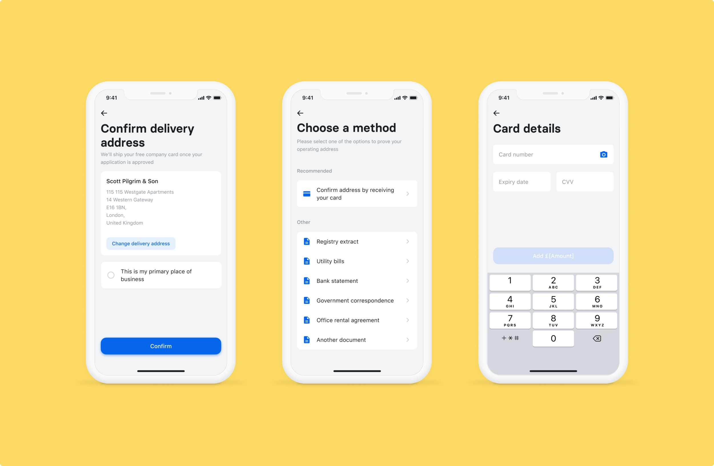
mobile
Onboarding: making documents upload smoother
scroll ↓
About the project
Business onboarding is a long and complex process because it must be compliant with legal requirements. We must verify that a business is legit to prevent fraudsters from joining our platform. It means that we make businesses provide documents if we can’t verify some information about them using data.
Collecting documents is the bottleneck in onboarding. Nearly 95% customers have to upload at least one document. That’s why it is crucial to make it as smooth as possible.
I know that it is 2021 and we should not collect any documents in digital world! That’s the North Star we are slowly and surely moving to. Getting approval from the legal takes time.
Previous iterations
We accept only some particular documents for verifying different information, e.g. operating address. But often people send us random files without checking what we can accept. Here are previous attempts at making those requirements clear.
Initially we had all requirements on one page. The screen got cluttered, but people still submitted wrong documents in large volumes, ignoring the right side if the screen.
When redesigning the whole app in the new design system, I tried to clean the page and moved content to the left, next to the uploading button
Ok, why reinvent?
👉 People largely ignored the list of required document and submitted random ones. According to support agents, the number of such attempts increased after redesign.
👉 Around 40% of people fail with their document submission at least once. Large part of them never tries again and we loose potential clients.
👉 Make the layout mobile-friendly. When I joined the team, we did not have onboarding on mobile apps (iOS and Android) at all. Over the course of the year, I designed it all for mobile. Also we created a unified design system that scales across web and mobile, so I applied it to this case.
👉 Make a universal solution that would work for Revolut Business and Revolut for retail customers.
Where to start?
I decided to do a few things before opening up Figma.
🤔 Talk to support agents and recall their feedback from shadowing sessions. Back in the days before COVID, we travelled to Krakow office with my product owner to shadow our support agents. We collected a list of feedback and observations. I tried to apply those findings in this redesign.
🤔 Check the data. We brainstormed some ideas with my PO and he checked the data around them. For example, we wanted to recommend some document from the list. It turned out, that we indeed have some document types that people normally find and our agents usually pass. So for each type of proof we added a recommended document.
Making instructions clear upfront
I inherited this project with the all the information about documents condensed on one page. Now it is separated into steps (link to the prototype).
Choose a document they have at hand. At this step, we suggest one type of document that we usually pass as ‘Recommended’. There is a way out with the option ‘Another document’ because sometimes agents pass people with documents outside of the list if they are legit.
Upload a document with instructions about this particular type (when it should be dated etc).
Confirm your submission. You can review both the document/documents you uploaded and the information you are trying to verify.
Communicating mistakes clearly
Our support agents told that they often had to type in the names of files to explain people which document has an error in it. Apparently, it happened often, as the data available to us indicated. So I created design allowing comments on particular documents directly. We also started showing previously uploaded documents — we oddly did not do it before.
Make it work on mobile
Mobile-first design scaled to web. When I joined, we did not have onboarding in the mobile app at all, but noticed the need for it. I designed the whole onboarding and shifted the approach to be mobile first, including the case of documents.
Mobile has an upside: we can allow taking photos of documents.
Next: Baby steps to the North Star
In the ideal future we want people to be free of the necessity of uploading documents at all while keeping our onboarding compliant. That requires a lot of effort on the fincrime level: my manager was fighting a lot for making product changes allowing us pass applicants without documents. So far some projects got approval and went live.
💡 Verifying operating address by activating a physical card delivered to you. We saw a lot of complaints from people working at home or from coworking spaces about the concept of operating address in general and about the lack of documentation. My manager got an approval from fincrime to allow confirming the place from where you run your business by activating the card.
💡 Verifying type of business by a link to website or social media. This was live before I joined, but the layout was confusing for people and they missed this simple option. I placed it in focus and used logos and of the most popular social platforms to communicate clearer that we can accept not only stand alone websites.
Results
We released updated flow for supporting documentation for four countries — United Kingdom, Italy, Spain and Portugal — in February 2020. As the result, conversion rate for those countries increased by 25%.


